
Why Print Collateral Strengthens Brand Recognition
The Psychological Impact of Tangible Materials
Neuroscience tells us that touch bypasses rational filters and speaks directly to memory. For any business exploring stationery and branding, this tactile fact matters. Print collateral such as business cards, brochures, and letterheads gives a brand physical form. When a prospect holds a well-crafted piece, they engage more deeply than a screen allows. The psychological impact of tangible materials is profound. Here is what printed items achieve:
- They command focused attention, uninterrupted by notifications.
- They create a sense of permanence and authority.
- They trigger an emotional response through texture, weight, and finish.
This is why stationery and branding work together. A business that invests in quality print signals reliability. The physical object leaves a lasting impression, and every subsequent encounter with the brand gains depth.
How Consistent Visuals Build Trust
Consider the last time a logo caught your eye on a coffee cup or a delivery box. Recognition, I find, rarely arrives in a single moment. It accrues through repetition. Print collateral gives a brand repeated physical presence in daily commercial life. This is where stationery and branding converge into a single, memorable impression!
Consistent visuals across business cards, letterheads, and envelopes create a unified identity for your business:
- same colour palette on every envelope
- identical logo placement on each document
- matching paper stock for quotes and contracts
When a client sees the same typography on a quote as on a delivery note, they register coherence. That coherence compounds into trust.
Memorability and the Senses in Brand Recall
Neuroscientists have found that the brain encodes physical objects through more neural pathways than it does for digital images. A screen flashes and is gone. A printed sheet sits in a hand, and the hand remembers.
That hand memory is what print collateral plants in the customer’s mind. The weight of the card, the texture of the stock, the crackle of a folded contract. These sensory signals become anchors for recall, and they bind stationery and branding into a single associative network. In South Africa, where inboxes overflow, a tangible sheet still commands a pause.
- the grain of a matte finish
- the resistance of a fold
- the permanence of a printed signature
Each touch of those materials drags the brand back into focus. That is why stationery and branding investments pay off in long term recall.
Differentiating Your Brand in a Digital World
In a republic where inboxes groan under unread newsletters, a crisp letterhead wins the battle for attention. Print collateral forces a physical pause. The brain treats a mailed piece as a real object, not a pixel to discard. That scrutiny is where brand recognition starts.
Digital domains overflow with identical templates and interchangeable fonts. Stationery and branding break that monotony. A business card on thick cotton stock, a quotation on textured paper, these artefacts claim a personality a PDF cannot fake. Your material, with heft and finish, becomes the outlier in the spam pile.
Differentiation in the digital world comes from what you can hold:
- A watermark that catches the light
- A folded brochure with deliberate weight
- A signature block that feels permanent
Each element separates your brand from ephemeral noise. While competitors chase algorithmic trends, your physical presence creates a fixed point. Stationery and branding in print give customers something to remember.
Essential Branded Pieces for Everyday Business
Business Cards as Miniature Brand Ambassadors
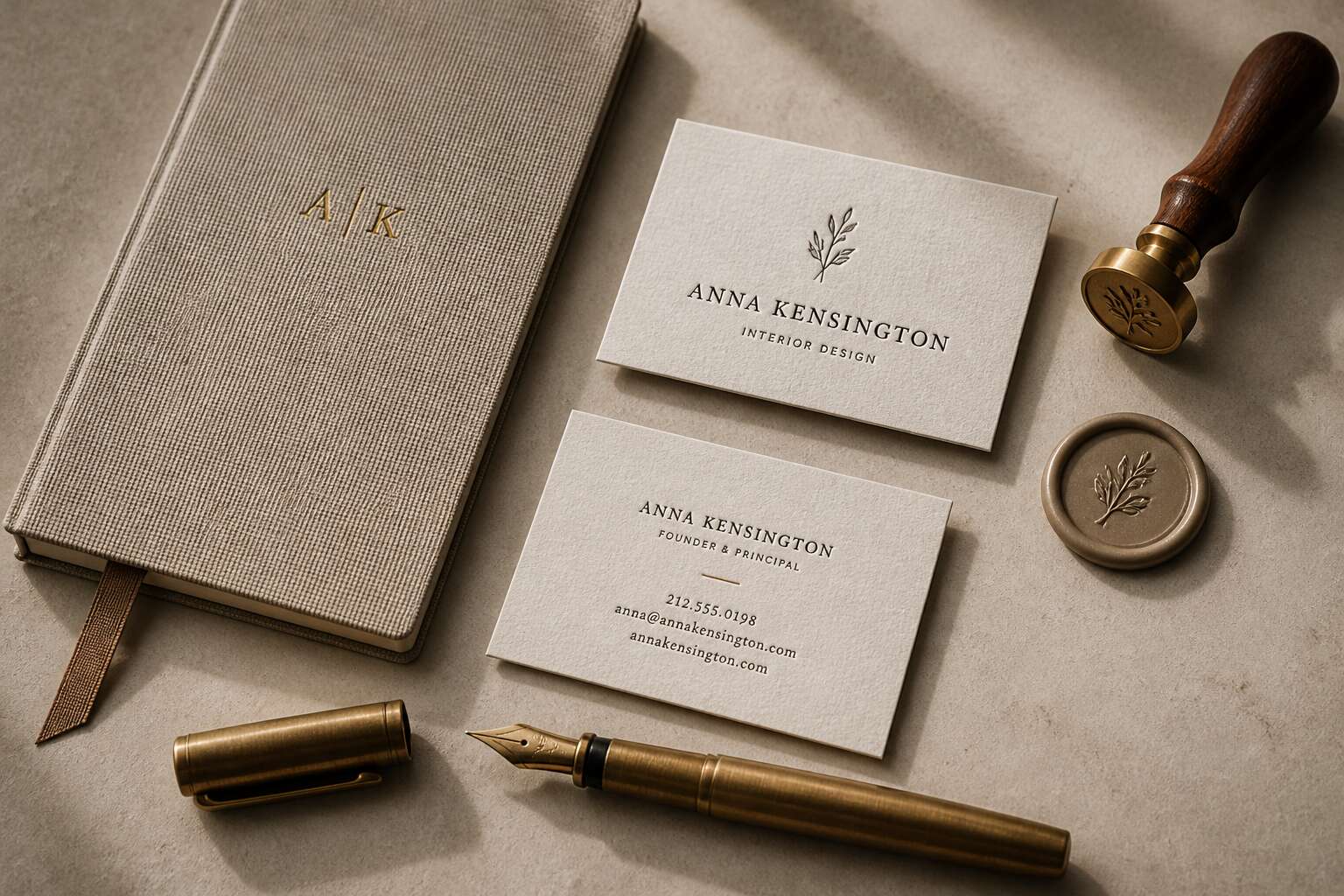
Seven seconds. That is how long a business card owns a stranger’s focus before it disappears into a pocket, a purse, or a bin. In South Africa, where trust is built on a handshake, the card becomes the physical argument that follows that handshake.
I have seen flimsy cards undo a firm handshake. Your stationery and branding choices start with paper weight, edge finish, and ink. These do not merely decorate; they tell a story of reliability. Consider what materials you hand over daily:
- a card that resists the humidity of a Durban summer,
- a structure that survives a week in a leather wallet,
- a texture that invites a second glance without shouting.
They determine whether that card survives. The link between stationery and branding is rarely so tangible as in this slim rectangle. Get it right, and you have a miniature ambassador working long after you leave the room!
Letterheads and Envelopes for Professional Correspondence
Letterheads and envelopes still set the tone before a single word is read. In South Africa, an email can be ignored, but a posted invoice or proposal gets opened. The paper’s weight, the envelope’s lining, the alignment of your logo, they all signal how you treat details.
A letterhead does more than carry your address. It shapes perception of your firm before the recipient processes the contents.
Your stationery and branding choices should speak the same language across every touchpoint:
– A crisp, cotton-based letterhead for formal contracts.
– A lighter bond for internal memos or routine correspondence.
– Envelopes with a subtle interior pattern for proposals.
Consistency here reinforces the memory of your business card. When the envelope, letterhead, and signature block share the same visual rhythm, your brand becomes familiar, even without a face in the room. That familiarity builds a quiet authority.
Notepads and Memo Pads That Reinforce Messaging
A sticky note pad might feel like an afterthought, but in South African offices, it gets passed from hand to hand. The receptionist uses it. The sales manager uses it. Your clients see it during meetings. If the paper is flimsy and the logo blurred, you have told them your standards are flexible. If the pad is sturdy and clean, you have said you care, full stop!
I like to keep a branded memo cube on every desk I visit. It does the quiet work of repetition. Each torn page carries your name without anyone feeling sold to. That is the charm of stationery and branding when done properly: the message is present but never loud.
The same design system carries across notepads, message slips, and internal route notes. When the colours and typefaces match your invoices, your business starts to feel like a place where everything is in order.
Folders, Brochures, and Presentation Kits
Most clients form a verdict about your competence before they read a single line of your proposal. The folder shapes that verdict in ways you cannot control. A presentation kit with mismatched inserts feels haphazard. The client may not know why, but they will feel it.
Your stationery and branding system should carry through to the folder shell, the brochure weight, and the pocket depth. The paper stock, the corner treatment, the way the brochure sits in the pocket. When the weight feels right, the client stops scrutinising and begins reading.
- Use 250gsm stock for the folder shell so it does not buckle under documents.
- Match the CMYK values of your logo across all inserts.
- Leave the back pocket unprinted so the client can add their own notes.
In South African corporate settings, the presentation kit is a test of intentions. A flimsy brochure says you save on the visible. A heavy, well-bound one says you invest where nobody is watching. That is the signature of stationery and branding done with intent.
Thank-You Cards and Follow-Up Stationery
The meeting ends. The follow-up decides what the meeting meant. In South African business, a thank-you card is not a courtesy. It is evidence you were paying attention while everyone else was scrolling.
Stationery and branding continue after the pitch. The card stock, the ink, the weight of the envelope. These small elements carry the same importance as the presentation kit, but at a smaller scale. The client reads your card before they read your proposal again.
Consider the practical pieces in a typical follow-up set:
- Recycled cotton paper that feels dense
- A logo printed in the exact CMYK match of your broader brand suite
- An envelope without internal printing, so the handwritten address stands alone
Each element tells the client you do not cut corners when nobody is watching. Stationery and branding, used with intent, turn a routine follow-up into a quiet demonstration of reliability.
Custom Stickers and Seals for Packaging
The unboxing ritual is the one marketing moment where the customer has already paid you. Every parcel that lands on a doorstep in South Africa goes through the same dance. The tape gives way, the flaps open, and the contents meet the light. In that moment, your packaging is the smallest stage your brand will ever command. Custom stickers and seals turn this transient ritual into a specific memory. They are the final piece of stationery and branding you can control before the box becomes recycling.
Stickers on the outer surface speak to everyone who handles the parcel, from the courier to the receptionist. Seals on the inner flap speak only to the person who opens it. I have opened boxes where the seal was the only sign the brand cared. Their range is practical:
– Tamper-evident seals that guard the box from interference.
– Die-cut stickers shaped like the logo, breaking the monotony of brown cardboard.
– Seals that mark the giveaway, the sample, or the limited run.
All are inexpensive. All are exact. All signal that your operation sweats the small stuff. Stationery and branding earn their keep in these small gestures, because the buyer notices them at the moment the parcel is opened.
Design Principles for a Cohesive Stationery System
Establishing a Color Palette and Typography Pairing
In any stationery and branding system, color and type define the visual order. A palette of two or three hues, drawn from your brand’s history, gives each piece a distinct yet unified appearance. Typography sets the register: a serif for formality, a sans-serif for approachability.
When pairing them, I start with the logo’s typeface. Use it for headlines, then choose a complementary face for body text. Ensure contrast in weight and scale, and test on plain and coated stock, as finishes alter shade. Do this early!
- Use one dominant color and one accent.
- Limit typefaces to two, one display and one text.
- Test legibility at 8pt, the smallest size you will print.
These choices, made once, affect every envelope, invoice, and memo. The result is coherence, so each piece fits the same system. In stationery and branding, consistency is the outcome of these principles.
Logo Placement and White Space Rules
In stationery and branding, logo placement is not a matter of centering and calling it done. It is a spatial decision. The logo anchors the piece, while the white space around it does the persuading. Generous margins signal confidence. Crowded layouts suggest haste, and no client wants a note that feels rushed.
I place the logo where the eye naturally rests, top left or bottom center, depending on the format. Then I protect that area. No other element competes with it. The date, the body text, the contact details, all live in their own zones, separated by deliberate emptiness.
- Keep at least 10mm of clear space around the logo.
- Let margins mirror each other across the spread.
- Reserve white space for the signature and closing lines.
This discipline turns a simple letterhead into a quiet statement of order. It is the quiet work behind the scenes that makes stationery and branding feel effortless.
Choosing Paper Stocks and Finishes
Paper carries the first message of any brand. In stationery and branding, cohesion lives in the materials. A system fails when the letterhead feels like newsprint and the business card feels like plastic. The paper stock establishes the physical quality of the brand. In South Africa, the finish must survive wide swings in humidity and temperature.
I select paper by weight, texture, and rigidity in that order. My sample room judgments usually come down to a few things:
- How the stock folds without cracking along the crease.
- How the ink dries without smudging under a thumb.
- How the sheet sounds when it slides from an envelope.
A 250gsm card with a soft-touch laminate signals a certain patience. A recycled cotton blend says something else. In stationery and branding, the finish changes how ink sits on the page, and the same logo on two different stocks reads as two different brands!
Balancing Aesthetics with Functional Layouts
Every piece of stationery has a job. A letterhead must convey contact details. A business card must survive a wallet, a briefcase, and a damp countertop. The layout decides those jobs. Grid systems hold the stationery suite together. When every piece shares the same margins and alignment points, the envelope, letterhead, and business card read as one operation rather than three accidents! Aesthetics only count if the layout survives real use. I keep a functional checklist for each design.
- Can the postal service read the address block?
- Does the logo survive a thumb or a stamp?
- Is there room for a note, a signature, or a doodle?
In stationery and branding, that balance decides whether the system works. A letterhead with exquisite whitespace but nowhere for a signature fails as a business tool. The layout should direct the eye, deliver the facts, and give the page back to the user.
Modern Trends in Branded Paper Goods
Sustainable and Recycled Materials
I watched a Johannesburg printer turn discarded office paper into crisp branded notepads. The shift toward recycled materials has changed what stationery and branding can say about a business!
Recycled cotton fibre and sugarcane bagasse deliver visible texture that digital design cannot replicate. A business using these stocks signals environmental awareness before a single word is read. The production cycle matters as much as the finished product. Soy-based inks and waterless printing shrink the ecological footprint further.
Consider the material options:
- Post-consumer waste paper with high recycled content
- Agricultural by-products like bagasse and wheat straw
- FSC-certified virgin fibres for premium applications
Each choice affects how recipients perceive your environmental commitment. The weight, the colour, the fibres under a thumb. These details anchor your stationery and branding in something tangible and responsible.
Minimalist and Eco-Conscious Printing Techniques
A quiet revolution is reshaping printed collateral. Modern trends lean toward fewer colours and uncoated paper. This approach reduces ink coverage and energy use during production. Getting printed goods right often takes a lighter hand. Delegated methods like thermography and letterpress add tactile depth without heavy saturation.
For stationery and branding, minimalism is a practical choice. A single debossed logo speaks clearly. The texture carries the message. Eco-conscious techniques include vegetable-based inks and alcohol-free presses. These options cut volatile compounds from the floor. Printers also offer platemaking systems that eliminate chemical waste.
Ordering smaller batches prevents excess inventory. Brands sidestep landfill contribution while keeping a crisp identity. I have seen this shift accelerate across Johannesburg studios!
Hybrid Stationery with Digital Integration
A crisp business card now carries more than a name. QR codes and NFC chips turn printed pieces into portals. This hybrid approach gives stationery and branding a second life. A brochure links to a product demo. A letterhead opens a playlist. The physical object remains the anchor, but the digital layer extends its reach.
In Johannesburg studios, I see textured card stock paired with scannable elements. The result feels intentional. Guests scan a menu, watch a chef’s story, then keep the card as a souvenir.
- Embedded watermarks trigger video messages.
- Personalised URLs track engagement from print campaigns.
- Augmented reality lets packaging explain its journey.
These tools demand restraint. The scan must serve the brand, not distract from it. When done well, the paper gains value. When overdone, it becomes noise. The best pieces let people choose their own path.
Bold Accents, Foil Stamping, and Embossing
Metallic ridges catch the light before a single word is read. Foil stamping now appears on invoice slips, gift tags, and packaging, while embossing adds depth that photographs cannot capture. In Johannesburg, designers pair thick cotton stocks with raised metallic marks to make mail feel ceremonial.
Consider the current markers:
- Chromatic foils that shift colour with the viewing angle.
- Blind emboss for quiet, tactile logos.
- Deboss combined with foil to build layered brand marks.
These treatments turn stationery and branding into a sensory encounter. People reach out to feel the ridge. A simple letterhead with a pressed edge outperforms a screen. I have held pieces that felt substantial and lasting. That is the point. For stationery and branding, the boldest move is often the quietest one.
Personalized Elements for Client Delight
The comp slip is dead. Long live the comp slip with the client’s name on it. In Johannesburg, branded paper goods are making a quiet comeback through personal touches. Variable data printing allows you to swap a standard template for each client’s name, project reference, or a single bespoke line without breaking the layout.
People notice these details. They keep them.
- Custom envelope liners printed with a client’s initials.
- Die-cut business cards shaped like a product silhouette.
- Follow-up notes in a handwritten font that matches your actual script.
These additions lift stationery and branding from transaction to treat. That moment of recognition, where the client sees their own details reflected in the paper, is where stationery and branding earn their keep.
Tracking the Return on Investment of Branded Collateral
Metrics for Brand Recall and Customer Response
Sixty-four percent of consumers say a shared brand experience influences their purchase decisions. That figure should matter when you spend money on printed collateral. The return on stationery and branding often hides in subtle signals, not dramatic spikes in sales.
Brand recall shows up in unsolicited mentions, repeat inquiries, and how quickly people remember your logo. Customer response appears as direct actions: phone calls, quote requests, website visits. Track each piece with a unique code or phone extension. Ask every new client how they heard about you.
- Response rate per printed item
- Time from first contact to conversion
- Unaided recall of your brand message
These numbers connect your stationery and branding budget to observable behaviour.
Integrating QR Codes and Tracking URLs
Your stationery and branding budget should produce trackable results. We put a QR code on each reply card. Every quote carries a tracking URL. These small additions create a data trail. You can see which pieces lead to calls, clicks, or nowhere.
A simple test reveals the truth.
- Scan count per design
- Time from first scan to inquiry
- Share of visits from each URL
These three numbers will surprise you. The expensive brochure may underperform the simple flyer. The data will trash a few assumptions.
Feedback Loops from Sales Teams and Clients
That box of unsold brochures in the corner tells a story. The return on investment of branded collateral appears in the details, the dog-eared price list a salesperson refuses to replace, the client who remembers your name because of the weight of your paper. Feedback loops turn these fragments into direction.
Sales teams speak in results, not aesthetics. They will tell you which pieces earn their place in a briefcase. Clients offer quieter clues: a question about your printing process, a compliment about your envelope, silence when a mailer arrives. Listen for all of it.
Stationery and branding thrive on this exchange. Every decision about paper and ink becomes sharper when informed by the people who actually use your materials.
Cost per Impression Compared to Digital Ads
The average cost per impression for a digital ad is south of a cent, but that figure ignores retention. A printed price list earns its cost every time a salesperson pulls it from a bag. stationery and branding produce impressions that do not expire when a screen refreshes. A banner ad vanishes in a scroll. A branded folder sits on a desk for weeks.
Measured properly, the return on investment comes from counting real touches. Compare a R3 brochure delivered to 200 clients against R2,000 for 10,000 online impressions. The brochure triggers a follow-up call. The digital ad triggers a quick scroll.
Consider what you track:
– Number of times a piece is referenced during a sales meeting.
– Length of time a client keeps the item after the deal closes.
The cost per impression stays low when your materials survive the first glance. That is the quiet math of stationery and branding.
0 Comments