
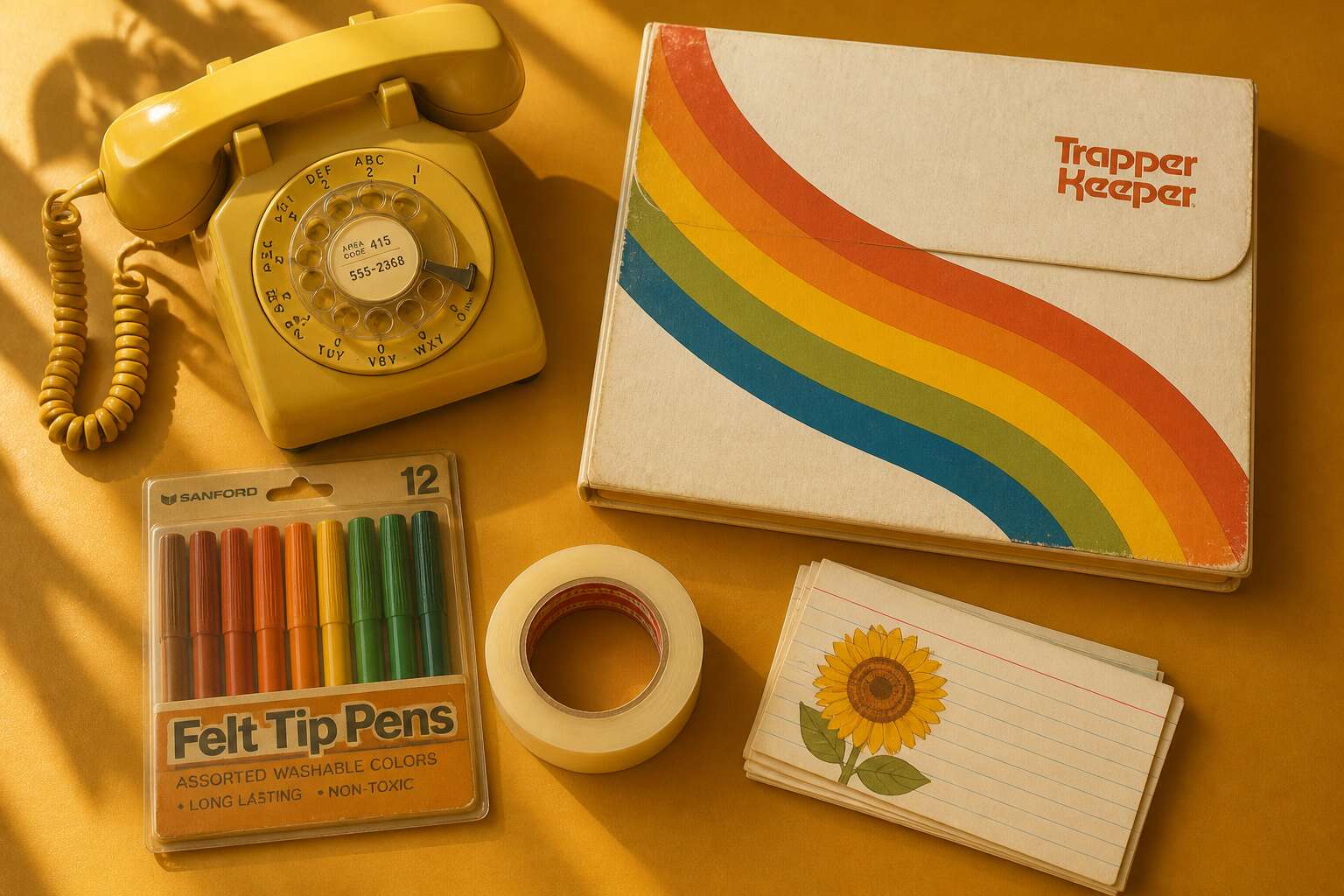
The Visual Language of the Groove Era
Exploding Color Palettes: Burnt Orange, Avocado Green, and Mustard Yellow
Avocado green did not fade quietly. It occupied the space between nature and artifice, lending 70s stationery a tactile warmth that modern palettes often lack. Burnt orange clashed openly with mustard yellow on letterheads that refused to whisper.
These colors were never incidental. They carried the era’s conviction that objects should speak, even the humble notepad.
- Burnt orange paired with deep brown
- Avocado green with cream and gold
- Mustard yellow with rust and chocolate
The combinations appear aggressive, yet they hold a strange harmony. For anyone sorting through vintage stock, the visual noise makes perfect sense. It was a language of assurance, written in pigment.
Typography & Print Trends: Psychedelic Swirls, Rounded Serifs, and Earthy Textures
The typefaces of the 1970s were not designed to be read quickly. Psychedelic swirls demanded a second glance. Rounded serifs softened the edges of corporate communication. On 70s stationery, letterforms carried as much meaning as the words themselves.
Printers experimented with earthy textures that mimicked wood grain and woven fabric. These surfaces gave paper a physical presence. The tactile quality mattered because it signaled authenticity. A letterhead with a rough, fibrous finish suggested honesty. A smooth, glossy surface implied modernity. That contrast still fascinates me!
Consider the visual vocabulary of the era:
- Swirling, liquid letterforms inspired by hallucinogenic poster art
- Rounded, bulbous serifs that appeared almost edible
- Wood grain and marbled patterns printed directly onto notepaper
Each element pushed against the rigid grid of earlier decades. The groove era typography celebrated excess and playfulness. South African producers of 70s stationery adopted these trends with local flair.
Pattern Power: Geometric Grids, Abstract Florals, and Paisley Overload
The pattern explosion of the 1970s turned 70s stationery into a visual argument. Geometric grids lined up in strict rows, then fractured into optical illusions that seemed to move on the page. Abstract florals abandoned natural stems and grew into bold, distorted shapes. Paisley overload layered teardrops until the eye could not focus. South African printers gave these motifs their own energy, using dense ink coverage and high contrast.
A typical set of 70s stationery from that era might include:
– grid-based letterheads that shifted from simple lines to hypnotic checkerboards
– floral notepaper with oversized petals and no visible roots
– paisley envelope liners with repeating teardrops in multiple scales
Each pattern carried its own message. Grids suggested order with a twist. Florals offered a softer, organic counterpoint. Paisley simply refused to be ignored. The visual language was loud, busy, and deliberately unsubtle.
The Influence of Graphic Design Legends on Everyday Paper
In 1972, Milton Glaser’s portrait of Bob Dylan became a poster phenomenon. That visual energy moved from art galleries into the hands of everyday people. By the late 1970s, 70s stationery products carried the influence of graphic design legends who changed how commercial art looked.
Push Pin Studios, where Glaser and Seymour Chwast worked, brought back Victorian ornamentation and mixed it with psychedelic palettes. South African printers paid attention. They translated these bold ideas onto letterheads, notebook covers, and envelope liners for local consumers. I find it remarkable how quickly these designs travelled across the Atlantic!
The history of these design movements appears directly on the paper goods themselves.
Signs of that influence on 70s stationery include:
- Hand-drawn letterforms with visible ink texture
- Sunburst motifs from vintage advertising
- Overlapping image layers that echo screen printing
Essential Desk Accessories and Paper Goods
The Rise of the Trapper Keeper and the Laminated Binder
In 1978, the Trapper Keeper sold over a million units in its debut year. That laminated binder became the central item in 70s stationery for students and office workers alike. Its flexible cover and attached folder system replaced the flimsy paper folders that scattered across desks.
Essential desk accessories followed a similar logic of durability. Brass swing-arm staplers, heavy ceramic pencil cups, and rotary index files occupied South African desks. The tactile weight of these tools signaled permanence in an increasingly disposable culture.
- Desk pads with inked monthly calendars
- Self-inking date stamps for paperwork
- Magnetic paperclip holders with weighted bases
The binder system paired perfectly with these desk objects. A laminated cover resisted spills. A hole punch aligned pages into a tidy archive. The 70s stationery era understood something simple: smart design should protect the things that matter.
Memo Pads, Note Cubes, and the Art of the To-Do List
The laminated binder protected the big picture, but 70s stationery thrived in the small details. A perforated memo pad caught every phone message. The note cube stacked beside the telephone held one clear thought per page. Each sheet tore away with a sharp rip.
To-do lists demanded discipline. Office workers wrote each task by hand, numbered the pages, and archived them in those binders. The stack of completed lists proved the day’s labour. Crossing off each finished task felt almost ritualistic.
- Perforated memo pads with carbons underneath
- Note cubes sized for a single sentence
- Desk diaries with timed appointment slots
These paper goods carried the weight of daily bureaucracy. The 70s stationery era gave those small sheets a permanent role in office life.
Letter Writing 101: Stationery Sets, Notepads, and Matching Envelopes
Letter writing demanded a particular set of tools. In the 70s, stationery sets paired letterheads with matching envelopes, and the ritual of writing by hand remained a daily act for many South Africans. The choice of paper carried meaning. A floral print said something different from a bordered monogram, though both shared that unmistakable 70s texture.
A proper desk drawer held the essentials:
- Airmail paper with its blue edging
- Plain white bond for formal replies
- A box of envelopes that matched the letterhead
- A ballpoint pen that actually wrote on coated stock
The envelope mattered as much as the message. A handwritten address in blue ink told the postman and the recipient that someone took the time. That personal gesture was the point of 70s stationery.
Desk Organizers: Mushroom-Shaped Holders, Lucite Trays, and Wicker Baskets
In every 70s stationery collection, the desk itself required organization. The mushroom-shaped holder, with its polka dots, kept paperclips and rubber bands in order. A Lucite tray held the day’s letters. I have yet to find a modern organizer with such brazen charm!
Wicker baskets caught everything else: envelopes waiting for stamps, odd notepads, and the occasional dried flower. The effect was deliberate, a clutter that showed the owner wrote often.
- Mushroom holders for small desk fripperies
- Lucite trays for incoming and outgoing mail
- Wicker baskets for stray paper goods
These pieces gave the ritual a home, turning a simple desk into a personal workspace.
The Iconic Spiral Notebook: Wire Bindings and Marbleized Covers
The spiral notebook was the workhorse of 70s stationery. Its wire bindings clicked and clattered, a sound that meant ideas were being captured. The marbleized covers swirled in blues, greens, and reds, each one unique.
These notebooks travelled everywhere:
- A university student in Cape Town carried one to lectures, filling pages with hurried economics notes.
- A mother kept one beside the telephone in Durban, recording messages in looping handwriting.
- A handyman used one to sketch measurements and rough plans.
The wire binding allowed the notebook to fold flat, a simple mechanical advantage that modern journals still struggle to match. I still remember the satisfying hump of a fully folded spiral notebook and the way those loops caught the light. No two marbleized patterns were identical, and that individuality gave each notebook a quiet personality before a single word was written.
Materials, Textures, and Manufacturing Quirks
The Allure of Recycled Paper and Organic Wood Pulp
Paper in the 1970s felt less like a surface and more like a living material. Recycled paper, flecked with unbleached fibers, gave each sheet a distinct tooth. Organic wood pulp, processed without harsh chlorine, kept a warm oatmeal tint. Manufacturing quirks meant no two packs were identical. I once found a tiny seed or a darker strand woven into a page!
For the collector, this unpredictability was the charm:
- Batch thickness varied slightly
- Fiber clusters caught the light
- Edges feathered instead of cutting clean
Writing felt personal when the pen stumbled over a stubborn pulp piece, a quiet reminder of the tree. That tactile honesty defined 70s stationery, unlike sterile bond paper.
Hot Stamp Foil, Embossing, and the Grip of the Ballpoint
Hot stamp foil turned the humblest memo pad into a small treasure. Heat pressed shimmering gold and copper onto cardstock, leaving precise mirror surfaces that never dulled. Embossing worked the opposite way, pushing paper upward from beneath to create raised ridges and soft hollows. Running a finger across those details revealed a depth that flat printing could never fake.
The ballpoint pen met these textured surfaces with a satisfying catch. Deeply embossed letterheads demanded a slower, heavier hand, and the foil sometimes repelled ink, forcing momentary pauses. For 70s stationery, these quirks defined character.
- Foil occasionally adhered unevenly, giving a gently distressed look
- Embossing dies grew worn, softening every sharp edge
- Glue struck through on memo pads, making pages cling together
Each imperfect sheet carried a quiet signature from the machine that made it.
Foam, Vinyl, and Plastic: Why 70s Stationery Felt So Different
Foam, vinyl, and plastic gave 70s stationery an almost unnatural presence. Desk pads swelled with cushioned heft, their surfaces soft enough to trap a thumbnail. Vinyl binder covers gleamed under fluorescent light, smelling of hot machinery. Plastic memo trays came out of moulds with tiny seams, faint ridges that betrayed the injection process.
These materials did not age gracefully. Sunlight turned stiff covers brittle. Heat made foam breathe, releasing stale air. Adhesive peeled in curtains, leaving ghostly pale rectangles on cardboard. Every crack and ripple recorded haste and chemistry.
- Foam brightened then yellowed unevenly
- Vinyl split along folded edges
- Plastic grew sticky where plasticiser bled
The imperfections were honest, almost archival. A worn pad from those years preserves a record of sunlight, heat, and careless storage.
Nostalgia, Collecting, and Contemporary Revival
Why 70s Office Supplies Trigger Powerful Memory Responses
Psychologists call it the reminiscence bump, the tendency to recall objects from adolescence with unusual clarity. For South Africans who grew up during years of cultural isolation, 70s stationery carries a specific charge. Sensory memory bypasses the narrative parts of the brain, so the grain of a paper stock or the smell of mimeograph ink summons an afternoon more forcefully than any photograph.
Collectors now hunt for period pieces at flea markets in Johannesburg, Durban, and Cape Town. Demand for unopened packages and original boxes has created a quiet economy.
- Display cabinets built for single-colour pen collections
- Pencils with advertising imprints from defunct local businesses
- Erasers and paperclips in original blister packs
Contemporary designers borrow this vocabulary without reproducing it. New 70s stationery lines replicate the texture of aged paper and the muted finish of vegetable dyes. The revival gives the hand a reason to pause, restoring permanence to the digital workspace.
Hunting for Vintage Finds: Flea Markets, Etsy Shops, and Estate Sales
Tracking down 70s stationery requires patience. Johannesburg flea markets reward early risers who catch dealers unpacking estate sale boxes. Cape Town antique shops keep original price stickers on plastic binders. Durban collectors trade leads through WhatsApp groups, and the best finds rarely last a day.
Etsy sellers photograph every scratch and dent. Prices vary. A boxed set of ballpoints sells for R150. A complete avocado green desk set goes for R2000. Estate sales offer the best odds! I have seen families price an entire box of unused 1970s notepads at R40, unaware of what collectors will pay.
Designers purchase originals for reference. What they look for:
- Unopened pen packs with 1970s graphic design
- Notepads printed for defunct local businesses
- Binders with woodgrain or geometric laminates
The revival treats these objects as source material. New lines borrow their packaging shapes and printed details, yet the originals still hold their value.
Restoring and Preserving Knocked-Up Stationery: Tips for Collectors
Nostalgia draws most of us to this hobby, but keeping the finds alive requires patience. Restoring 70s stationery is a lesson in restraint. Bleach removes yellowing along with the paper’s integrity. Cracked plastic binders can be stabilised with archival tape, never superglue.
I store my pieces flat in acid-free boxes, away from Highveld sun. Wipe metal spirals with a dry microfibre cloth only.
– Keep felt-tip pens separate from notepads to prevent ink bleed.
– Slide loose memo pads into clear polyester sleeves.
– Support warped covers by stacking heavy books over them for one week.
Contemporary revival lines borrow heavily from these originals, yet a preserved set still commands respect. Collectors who care for 70s stationery properly ensure the next generation can hold the real thing, not just a copy.
How Modern Brands Reimagine 70s Aesthetics for Today’s Planners
There is a peculiar ache in finding a 1970s memo pad with a coffee ring that matches your own. Nostalgia for 70s stationery is not about accuracy. It is about a desk that promised order but delivered delightful chaos.
Collectors understand this. They hunt for the odd spiral binding, the weird mushroom shaped holder, the paper that smells faintly of a grandmother’s wardrobe. The hunt is the hobby. Preservation is the duty.
Contemporary revival is a strange mirror. Modern planners borrow the burnt orange and the chunky plastic, but they lose the grit.
- They smooth the textures into silicone.
- They replace the chunky spiral with a hidden binding.
- They shrink the oversized grids to fit a minimalist bag.
These are fine, but they are the sanitised version. In South Africa, where the Highveld sun bleaches everything, the originals hold their ground. That is why we keep collecting.
The Sustainability Link: How 70s Eco-Paper Connects to Current Trends
Seventy percent of South African consumers now prioritise recycled materials in everyday goods. That habit traces back to a forgotten precedent. 70s stationery relied on organic wood pulp that retained its fibrous honesty. Nobody bleached it into sterile whiteness. The paper kept its flecks, its rough edges, its willingness to age gracefully.
Collecting these sheets becomes a form of climate memory. Each memo pad teaches how paper should behave. It offers a lesson in decomposition.
Current trends circle closer to that frugal wisdom. Yet modern revival often misses the function. It borrows the texture without the decomposable soul. For collectors, the original endures precisely because that vintage paper embodied an eco ethic we are only relearning.
Styling Your Desk with Retro Stationery: A Practical Guide
Nostalgia, you see, is a tactile affair. I once found a 1970s scribble pad at a Johannesburg flea market, and the smell of aged wood pulp hit me before my fingers even touched the cover. That odour is a time machine. It reminds me of my father’s home office, a room I was forbidden to enter, yet whose contents I coveted endlessly. That is the pull of 70s stationery. It is not about the writing. It is about the memory of a hand that held the pen before you did.
Collecting these relics requires a specific kind of scavenging patience. Estate sales in Pretoria are goldmines, but you must dig past the porcelain dogs. For the serious collector, the condition matters less than the provenance. A memo pad with a coffee ring stain is worth more than a pristine one. It shows a life lived.
– Look for the unopened packs, they are rarer than hen’s teeth.
– Check the back of binders for old signatures or business stamps.
– Prioritise items with organic wood pulp, they age with character.
Contemporary revival styling is a tricky beast. Modern brands have tried to replicate the avocado greens and burnt oranges of the era, but they use glossy card stock that feels like plastic. You cannot fake a 1970s grain. When you style your desk, mix the old with the new. Use a retro spiral notebook for your daily thoughts, but pair it with a modern ergonomic chair. The contrast works. The old paper is forgiving, it absorbs ink without bleeding, and it holds a pencil mark without complaint. The new stuff is a shiny funeral for the craft. For those of us who know, the original 70s stationery remains the only true standard.



0 Comments