

Planning the perfect reception stationery experience
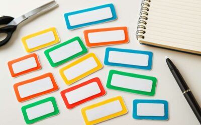
Understand guest flow and seating cards
A surprising stat: 68% of guests say thoughtful stationery shapes their memory of the wedding more than the cake. That’s why wedding reception stationery isn’t decoration; it’s hospitality pressed on paper! In South Africa’s light, the right typeface and texture speak softly, laying the welcome groundwork before anyone steps inside.
Planning the perfect reception stationery experience means coaxing graceful guest flow and seating cards into harmony. The aim is effortless movement and clear cues that reduce confusion without shouting for attention. When seating cards are designed, let typography, color, and material communicate the seating map with quiet confidence.
Key considerations include:
- Typography legibility from a distance
- Color cues that hint at table clusters
- Durable materials that withstand the venue’s climate
Small touches—foil, emboss, or a dash of local craft—offer personality without shouting; the wedding reception stationery acts as a quiet host, guiding guests to their seats.
Choose a cohesive design language across invitations, menus, and place cards
In South Africa’s golden light, stationery becomes memory. 68% of guests say thoughtful details shape their recollection more than the cake, a testament to the quiet power of a well-crafted suite. Planning the perfect reception experience begins with a single, elegant promise.
Choose a cohesive design language across invitations, menus, and place cards. One typeface family, a restrained color palette, and tactile finishes—linen, velvet, or foil—tie the suite together without shouting. This wedding reception stationery should welcome guests with confidence and understated glamour.
- Typography legibility and scale
- Harmonised color cues
- Textural finishes that endure
Let the design breathe across each card, so the arrival feels like a well-told story.
Create a realistic timeline for proofs, edits, and final printing
In South Africa, a well-timed printing plan can turn anticipation into a quiet glow of confidence; industry chatter suggests couples who lock a six-week proof calendar cut last-minute chaos by nearly half. For wedding reception stationery, the moment the design feels unified is the moment the celebration begins—long before guests arrive.
- 6–8 weeks before: finalize copy, imagery, and stock choices.
- 4 weeks: review first proofs for typography and color.
- 2 weeks: implement edits, adjust finishes and envelopes.
- 1 week: approve final proofs and press-ready files.
- 3–5 days: printing and dispatch to the venue.
Let the timeline breathe, letting ink and texture settle into a narrative that travels from invitation to place card, greeting guests with a seamless, memorable moment.
Set a budget that aligns with overall wedding stationery goals
Across South Africa, couples who dedicate roughly 6% of their wedding budget to stationery often report calmer arrivals and a stronger sense of place. The moment guests notice the paper’s weight, the ink’s shade, and the finish’s tactility, you’ve already told a story. Your wedding reception stationery is more than paper—it’s a tactile prologue to the celebration, a quiet preface that whispers what’s to come!
Plan with a budget that aligns with overall wedding stationery goals.
- Material quality and production choices that endure beyond the night
- Guest count and extra copies to avoid last-minute shortfalls
- Sustainable options that honour the venue and your values
Let the numbers grace the page with intention, and the design carry warmth, humour, or gravitas as suits your couple’s voice.
Sourcing and comparing vendors for quality and service
The hush before the first toast is louder than it sounds; the invitation’s weight begins the night’s story. Planning the perfect reception stationery experience goes beyond paper cost—it’s a tactile prologue to joy. The wedding reception stationery sets the mood, from deckled edges to ink that breathes on the page.
Sourcing and comparing vendors for quality and service is a study in trust: you’re not just buying cards, you’re partnering with craftspeople who shepherd the look from proof to press. In SA’s vibrant market, the range spans boutique printers to established studios—each with a distinct rhythm.
- Paper stock and texture
- Ink behavior and color accuracy
- Turnaround, communication, and reliability
- Sustainability and venue compatibility
Let the collaboration breathe a consistent voice across the suite, and the night will unfold with a quiet assurance. Ultimately, the right partners translate mood into material, whispering what’s to come.
Design options and customization for wedding day stationery
Typography and font pairings that match your theme
A crisp invitation can start the day with memory. A recent Cape Town designer notes, “Paper is memory you can hold.” That truth echoes in wedding reception stationery, where texture and tone set expectations long before a first glance at the invitation.
Design options and customization begin with mood, then material. For South African weddings, you might explore stock ranging from cotton rag to soft-touch finishes, add foil accents, or experiment with wax seals and vellum wraps to add personality to the day.
- foil stamping in gold or copper
- textured paper or handmade stock
- die-cut shapes or gatefold formats
Typography and font pairings that match your theme can unlock a cohesive look. Classic elegance loves a refined serif with a script for names; modern chic marries a geometric sans with a restrained serif; rustic or outdoor settings benefit from a bold, legible slab serif paired with a delicate hand-drawn script.
Color palettes, branding elements, and mood boards
“Paper is memory you can hold.” A Cape Town designer once said. Design options and customization begin with color palettes, branding elements, and mood boards that translate a theme into tangible pieces. In South Africa’s diverse wedding scene, a well-curated mood board keeps invitations, menus, and day-of signage cohesive long before a single RSVP arrives.
- Soft neutrals with warm metallic accents
- Vibrant jewel tones balanced by matte black
- Earthy greens, sand, and ocean blues
Branding elements—consistent typography, logo usage, and color rules—are mapped in the board and carried across the suite for a unified look. This approach creates a tangible narrative that guests feel as they move through the day, and anchors the wedding reception stationery in memory.
Materials, finishes, and printing techniques to consider
‘Paper is memory you can hold,’ a Cape Town designer once said. For wedding design, design options and customization begin with the grain of the stock and the kiss of the finish. Materials shape tone—from plush cotton rag to recycled pulp—while finishes push the mood toward opulence or restraint. Printing techniques range from stately letterpress to crisp digital, with die-cut silhouettes and vellum overlays adding texture. This is the prologue where invitations, menus, and day-of pieces cohere long before a single RSVP is received.
- Cotton rag stock for luxurious tactility
- Recycled or FSC-certified papers for sustainability
- Foil stamping or metallics for restrained glamour
- Letterpress or die-cut shapes for texture
- Wax seals or custom stamps for memorable finishes
In a South African wedding narrative, these choices translate into coastal blues, veld twilight, and urban shimmer, weaving a consistent thread through wedding reception stationery.
Theme-driven design approaches from classic to modern
A Cape Town designer once said, ‘The invitation is a whispered forecast of the day,’ and it rings true in design options for wedding day stationery. From timeless classics to modern minimalism, theme-driven approaches weave a coherent mood across invitations, menus, and day-of pieces—your wedding reception stationery set as prelude.
Across a South African canvas, customization speaks in motifs: a coastal reef crest, veld silhouettes, or urban skylines. Pair a distinctive type pairing with a restrained palette, and the suite—invitation, RSVP, menus—becomes a cohesive story that guides guests with quiet elegance.
That narrative survives the ceremony through thoughtful alignment of day-of pieces, ensuring every touchpoint—from programs to welcome signs—feels inevitable, not accidental. All of it threads back to wedding reception stationery, a living memory of your day.
Essential types of reception stationery to consider
Guest communication and directional signage
Each reception begins at the doorway, where quiet signage conducts the evening the way a maestro conducts a symphony. “First impressions are lasting,” a designer once whispered, and clear guest communication keeps the mood calm as a cape of stars. In South Africa’s diverse venues, thoughtful directional signage directs guests from arrival to the dance floor with effortless charm, never shouting, always guiding. This is the essence of wedding reception stationery!
Consider essential types that anchor the experience:
- Welcome signs that greet guests and mark entry points
- Directional signage for parking, ceremony, and reception routes
- Quick-information cards or QR codes for schedules and services
- Guest book zones or memory signs inviting participation
Thus, the pageantry of signs becomes a friendly North Star, guiding every guest through a night of laughter and memory.
Seating charts, place cards, and escort cards
The backbone of seamless guest flow at a South African wedding rests on seating charts and their faithful companions. Thoughtful charts set the tone the moment guests arrive, guiding them to their table with calm precision and a whisper of story. In this field, wedding reception stationery becomes navigation, memory, and courtesy all in one.
Consider these essential types to anchor the experience:
- Seating charts that map conversations and sightlines, using clear typography
- Place cards that greet guests at their seats with warmth and personality
- Escort cards that orchestrate the journey from arrival to the dance floor
When these pieces align, the night feels effortless—an elegant procession through the venue that stays true to the moment’s mood and the couple’s story.
Menu cards and event programs
In SA weddings, the first impression often comes from what guests hold in their hands—the menu cards guiding the meal, the event programs narrating the night. A trend report notes that 68% of guests remember the mood of a wedding most vividly through the wedding reception stationery that frames it.
Menu cards and event programs anchor the evening with smooth cadence.
- Menu cards: outline courses, dietary notes, wine pairings, and design that mirrors the couple’s story.
- Event programs: provide a timeline, order of speeches, ceremony-to-reception transitions, and notes on special moments—kept legible and elegant.
As part of wedding reception stationery, these elements steer guests with confidence, letting the celebration unfold with focus on flavor, music, and memory.
Welcome signs, signage suites, and info stations
Even the chicest wedding glow fades if guests stumble over the signage—the real silent conductor of mood. A veteran planner says the mood sticks around because of the signs, not the cake. Signs are the punctuation marks of a night, turning a venue into a story rather than a throwaway checklist.
Essential types to consider: Welcome signs, signage suites, and info stations each serve a distinct purpose without shouting for attention.
- Welcome signs
- Signage suites
- Info stations
Keep them cohesive with the couple’s vibe—legible fonts, durable materials, and a colour language that travels from invitations to menus. In South Africa, wedding reception stationery should whisper direction while amplifying personality.
Thank you cards and keepsake options
Every wedding night hides a memory in plain sight. A quick glance at guest responses shows the lasting impression isn’t the dessert but the grace of a well-timed thank-you note and the charm of a keepsake. In South Africa, wedding reception stationery should whisper direction while amplifying personality—it’s the night’s quiet spell, weaving moments into a single story.
Two essential types to consider are thank you cards and keepsake options. They extend the glow beyond the dance floor, traveling from ceremony to late-night conversations with guests.
- Thank you cards echoing the invitation suite for a seamless story
- Keepsake options like guest-book alternatives, memory boxes, or mini prints
- Post-event mementos such as personalised envelope seals or small print keepsakes
These touches murmur in the room—precisely the detail that lifts wedding reception stationery from paper to memory, keeping the mood alive long after the last song.
Practical budgeting and procurement for reception stationery
Setting a realistic budget and expected ROI
‘Every first glance whispers of the night to come,’ a designer once whispered, and in South Africa that truth stands tall. The wedding reception stationery you choose doesn’t just announce the party—it conjures the mood guests carry into the evening!
Practical budgeting keeps the romance intact while protecting the bottom line. In my experience, every rand should feel like a note in a larger melody—think in rand terms, keep a modest contingency, and measure ROI as guest delight, brand consistency, and a cohesive aesthetic that minimizes waste.
- Print fidelity and color consistency across suites
- Timing and lead times for proofs
- Vendor reliability and after-sales support
Procurement thrives when you value relationship as much as price; choose partners who align with your theme and deliver on promises. The right balance lets the stationery shine without strangling the budget.
Strategies to cut costs without sacrificing design
First impressions linger, and in South Africa the wedding reception stationery often sets the mood before guests step onto the dance floor. A smart budget preserves romance and style alike, letting every rand work harder. The goal: elegant design without waste from RSVP to toast.
- Consolidation of color runs across items
- Versatile printing techniques to minimize setup
- Reuse of design elements to reduce proofs and revisions
Procurement is about reliability and timing. Lock in one trusted partner for design alignment, proofs, and delivery. Request samples, set a color standard, and build in a modest contingency for embellishments. Clear briefs save waste and keep the look cohesive.
With disciplined budgeting and savvy procurement, your suite reads as premium without the premium price.
Production timelines, proofs, and rush order handling
Practical budgeting for wedding reception stationery hinges on aligning design, proofs, and delivery into a single, trustworthy workflow. Lock in one printer, request color-accurate proofs, and build a modest contingency for embellishments. Clear briefs save waste and keep the look cohesive from RSVP to toast. If your stationery isn’t saying “wow” by the time guests arrive, you’ve already overpaid for a sigh.
Procurement is about reliability and timing, especially in South Africa. A smart partner takes the sting out of revisions and quietly handles rush orders with grace—preventing the midnight email storms. A clear production timeline helps avoid surprises.
- Concept and initial design approval
- Color checking and final proofs
- Print, QA, and expedited shipping
That structure keeps budgets sane while preserving polish.
With disciplined budgeting and savvy procurement, your stationery suite reads premium without the premium price.
Vendors, materials, and comparison checklists
Budgeting for wedding reception stationery is a careful lyric of costs and craft. In South Africa, a steady printer becomes your co-conductor, smoothing revisions and quieting rush orders before they derail the timeline. A single, color-true partner keeps RSVP to toast cohesive, with a modest buffer for embellishments that spark without breaking the bank. This is how your wedding reception stationery reads!
- Reliable vendors and transparent lead times
- Materials, finishes, and printing techniques that fit the design
- Clear revision policies and proofing cadence
- Shipping, rush capacity, and contingency handling
With disciplined budgeting and smart procurement, the suite of elements—papers, inks, bindings—speaks premium without premium price. In SA, a thoughtful comparison checklist turns choices into confidence, letting you pass every glance-and-tap test with calm. Your wedding reception stationery becomes a practical romance, a testament to craft over cost!
Printing methods, materials, and finishing touches
Digital vs. offset printing: what works best for you
Bold, unambiguous invitations set the tone, and the printing method you select tilts the mood. Digital printing offers brisk turnarounds and personalised options for small runs, while offset printing yields deeper chromatic depth and a tactile gravitas for wedding reception stationery in SA markets.
Paper stock anchors the design—cotton rag, textured wove, or recycled boards with heft. Finishes are punctuation marks: foil stamping for flourish, embossing for shadowed texture, and letterpress for a tactile whisper. Spot UV catches lamplight without shouting.
- Foil stamping
- Embossing or debossing
- Letterpress texture
- Spot UV or satin varnish
When weighing digital vs offset, run length, budget, and the desired tactility shape the suite, linking mood boards to color-faithful production.
Paper stock, envelopes, inserts, and addressing
“The first hello is the invitation,” says a Cape Town stationery designer, and in South Africa that hello often doubles as a mood-setter for the entire day.
Printing methods shape the feel for wedding reception stationery: digital printing offers brisk turnarounds and personalised small runs, while offset printing delivers deeper chromatic depth and a substantial, tactile finish.
Paper stock anchors the design—cotton rag, textured wove, or recycled boards with heft. Finishes punctuate: foil stamping for flourish, embossing for shadowed texture, and letterpress for a tactile whisper. Spot UV catches lamplight without shouting.
Envelopes, inserts, and addressing complete the suite for wedding reception stationery: matching formats, weight, and seal choices; address execution through digital return address printing or hand-lettered calligraphy, with return envelopes sized for typical SA postal services.
Finishes like foil stamping, embossing, and letterpress
“The first hello is the invitation,” says a Cape Town stationery designer, and in South Africa that hello often sets the mood for the entire day—an essential element of wedding reception stationery. Digital printing offers brisk turnarounds and personalised small runs, perfect for intimate celebrations, while offset printing delivers deeper chromatic depth and a substantial, tactile finish.
Paper stock anchors the design—cotton rag, textured wove, or recycled boards with heft. Finishes punctuate:
- foil stamping for flourish
- embossing for shadowed texture
- letterpress for a tactile whisper
Foil stamping adds flourish, embossing gives shadowed texture, and letterpress delivers a tactile whisper that guests remember. Spot UV catches lamplight without shouting, keeping the overall look refined through reception and photos.
Sustainability and eco-friendly options
Proofing, color matching, and quality control processes
Across South Africa, the first glimpse of a wedding invitation sets the mood for the night to come. One study suggests guests form a lasting impression in seconds, and the tone of your celebration travels from that opening envelope. In wedding reception stationery, every choice—paper weight, ink hue, and tactile promise—speaks before a single word is read.
Printing methods, materials, and finishing touches shape the story you want to tell. A stock with natural texture and a whisper-thick edge changes color perception, while subtle surface treatments add memory to the moment.
- color fidelity and print depth
- paper texture and weight
- trim accuracy and alignment
Proofing, color matching, and quality control are the quiet guardians of elegance. Soft proofs preview how your palette travels through light, color matching harmonizes measurements across pieces, and a final QC pass guards against misalignment and finish glitches before anything leaves the studio.


0 Comments